White Oak · Story 03 / 08
How do you turn a write-off into a first choice?
A brand finds its people.
Then gives them a reason to stay.
White Oak’s wider transformation took it from Angostura’s lowest-selling rum to its highest-selling product. A series of campaigns helped give the brand a fresh place in local culture.
These projects tell that story through personalities, Carnival, music and movement.
01 / Reign
When It Pours,
You Reign.
Who gets to be royalty?
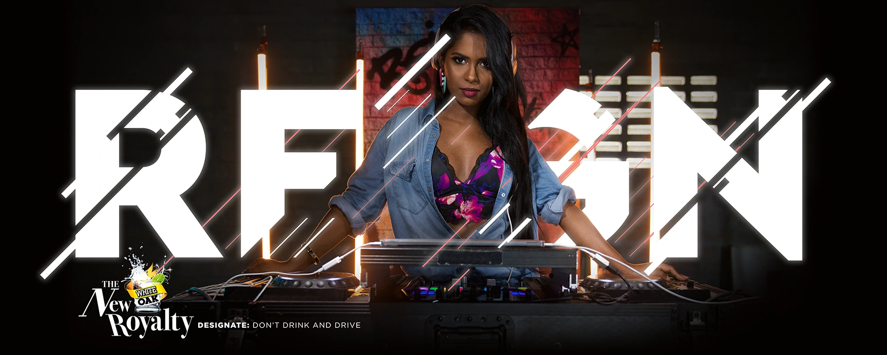
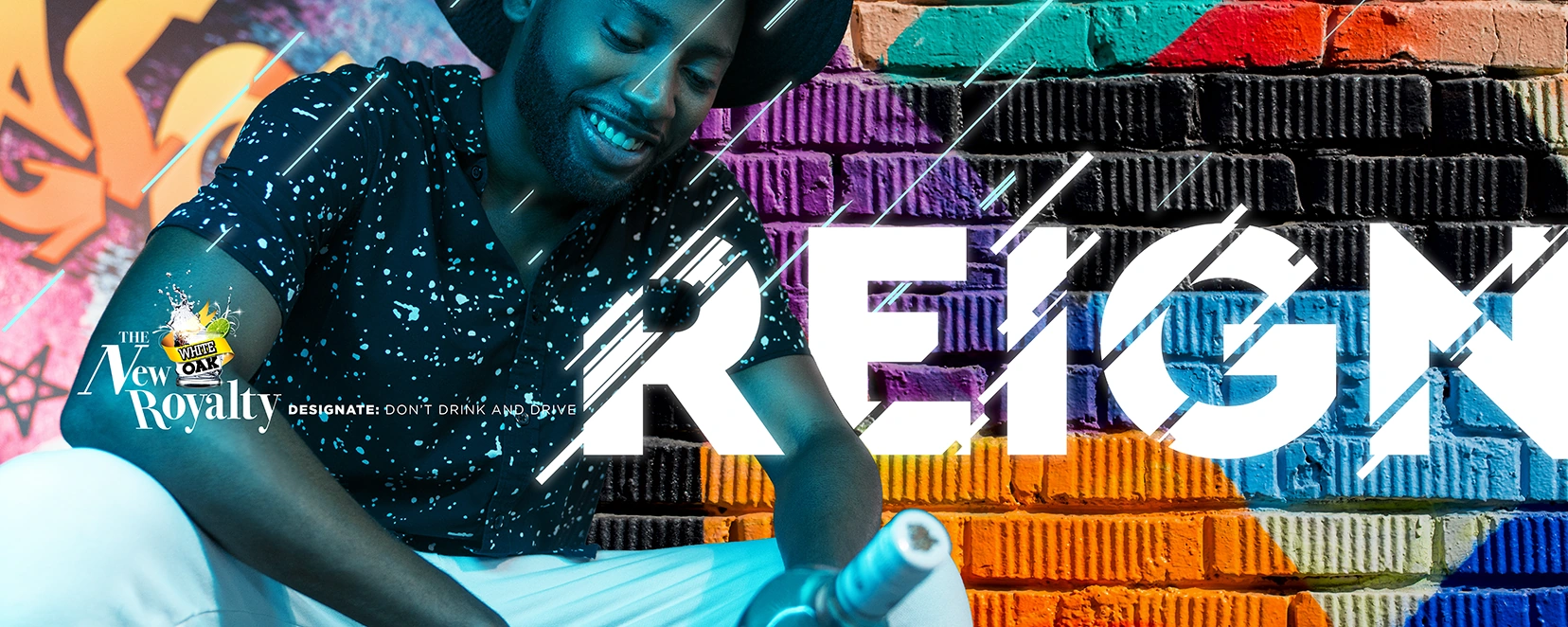
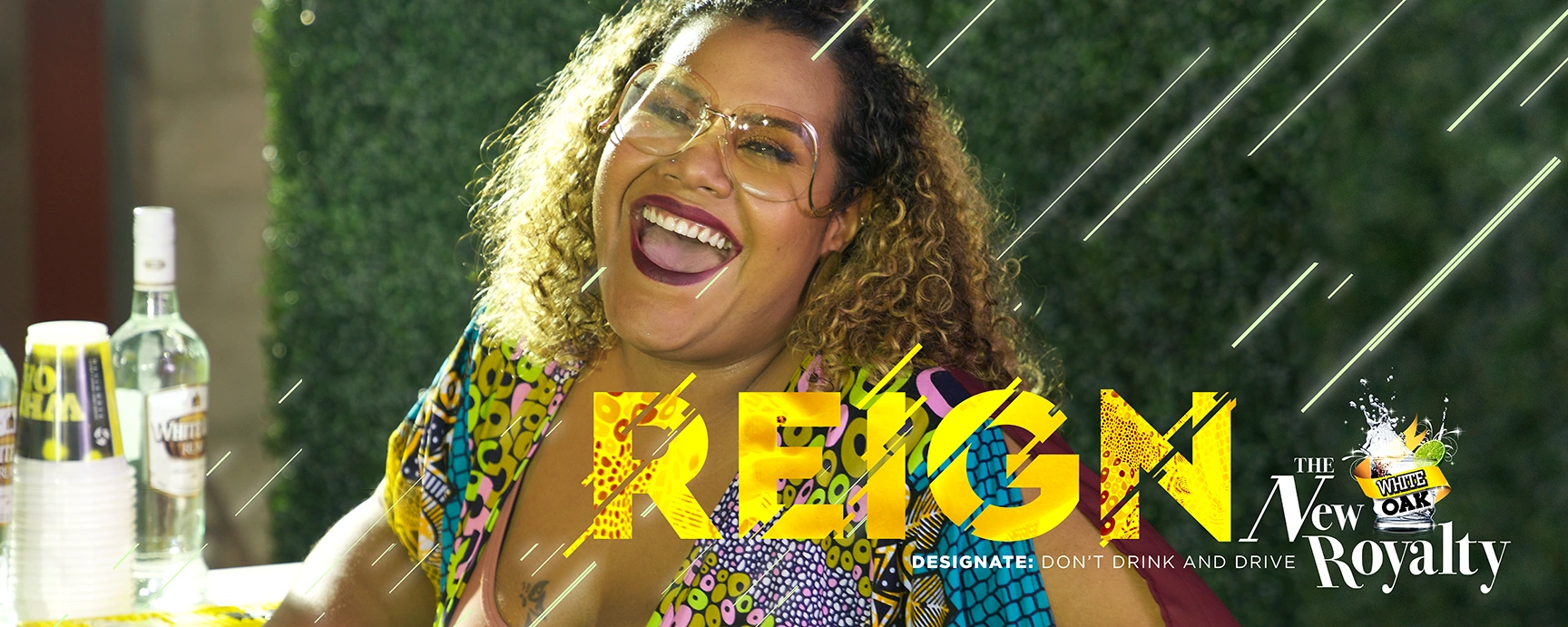
The White Oak drinker was evolving. Reign put a new generation of personalities at the centre of the brand: different backgrounds, different ambitions, a shared confidence in being themselves.
A new cast of characters. A new expression of White Oak.
The thinking behind the campaign
Give people a reason
to recognise themselves.
The creative moved beyond a single picture of the White Oak drinker. Individuality became the connection: people from different industries, ethnicities and social groups could all belong in the same brand world.
The case study brings together the audience thinking, campaign work and filmmaking behind that shift.
Selected outdoor artwork
Different personalities.
The same confidence.
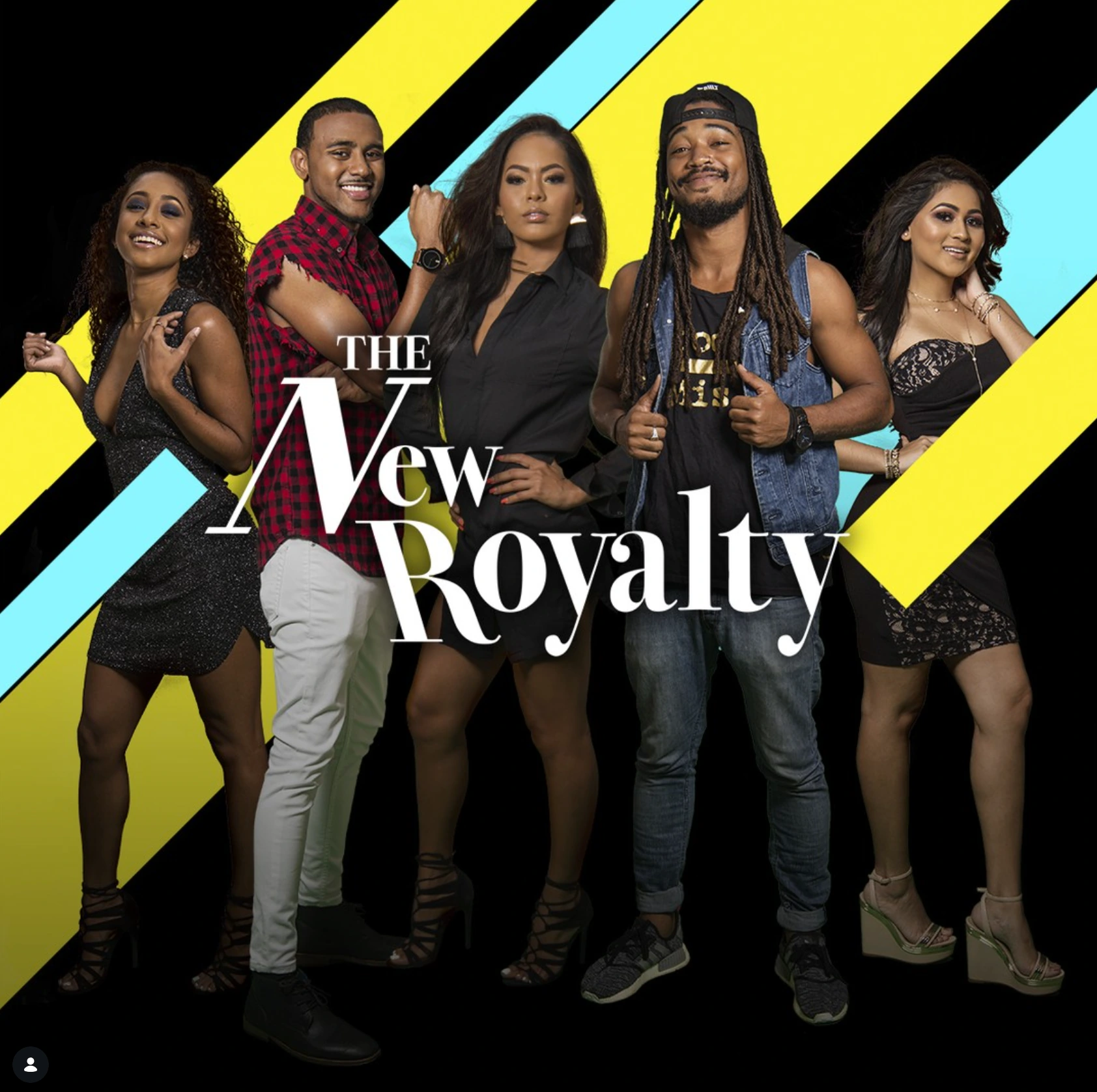
02 / The New Royalty
What if Carnival coverage
became a show people followed?
For Carnival 2019, The New Royalty followed a group of young Trinidadians through the season. Personalities, friendships and the moments between fetes became the story.
White Oak’s presence at Carnival became part of an unfolding series, giving audiences a cast to get to know and a reason to come back.
The series, the characters and the audience response, brought together in the campaign case study.
Supporting social artwork
A cast to follow.
A conversation to join.

03 / Together We Reign
Could a brand become part
of the soundtrack?
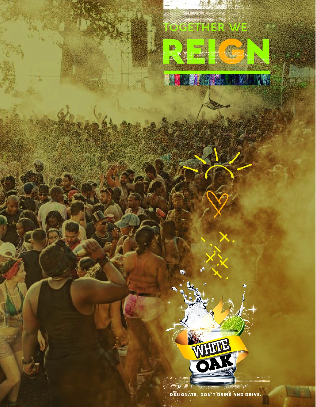
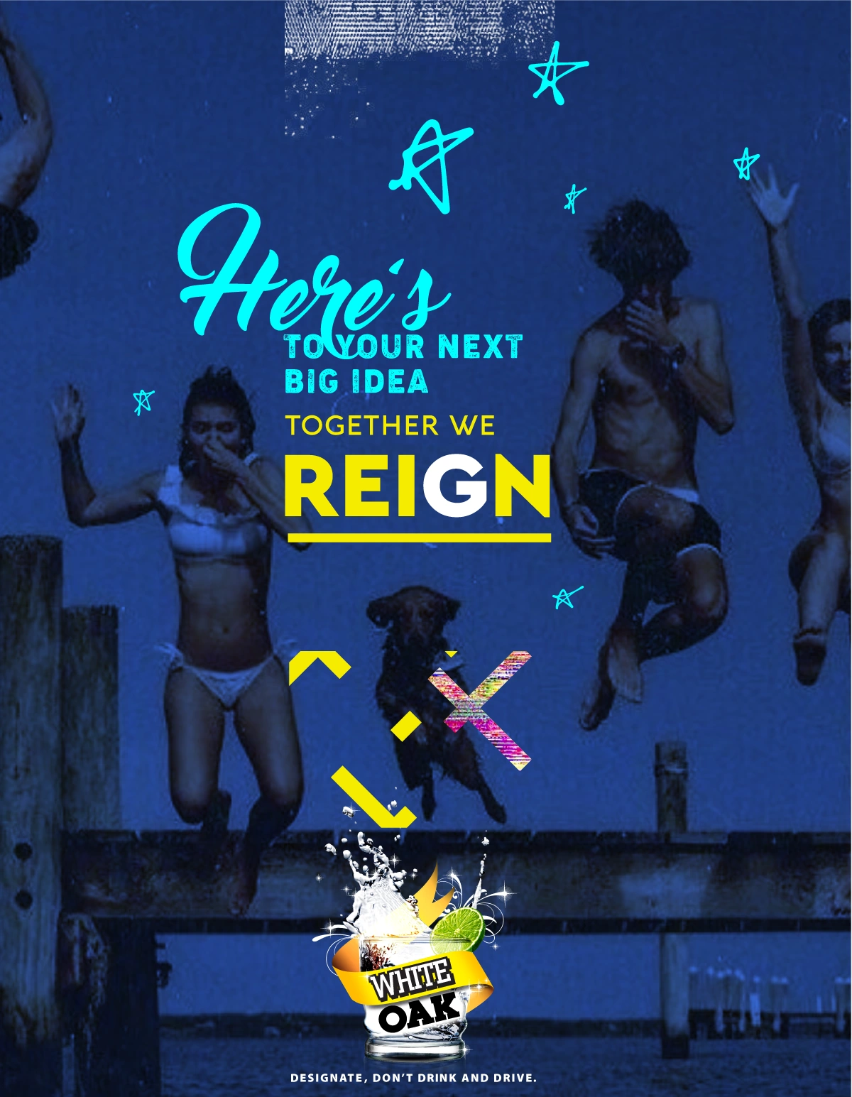
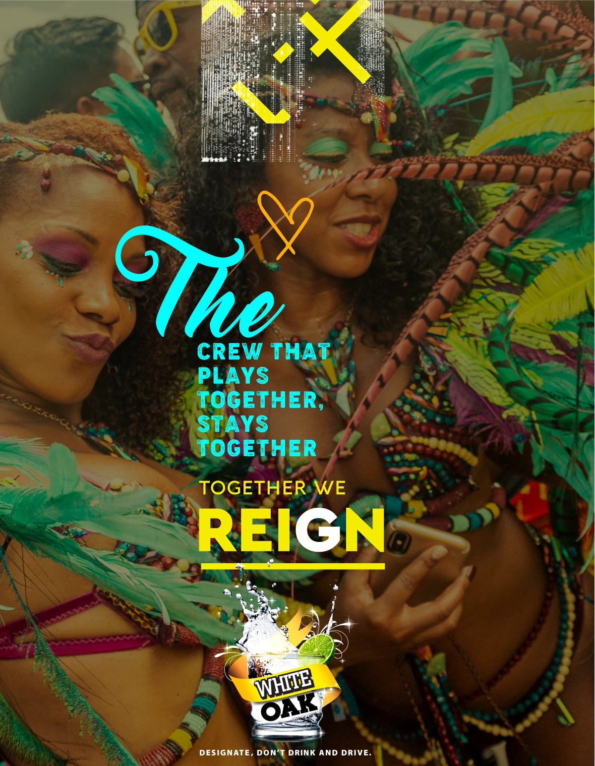
Together We Reign took the campaign into music. Performance, personality and the pleasure of being together gave the idea a different way to connect.
The brand’s world could be expressed through a song and a shared moment, with the music carrying the story.
Together We Reign / Campaign artwork
The feeling
of being part of it.
04 / The documentary
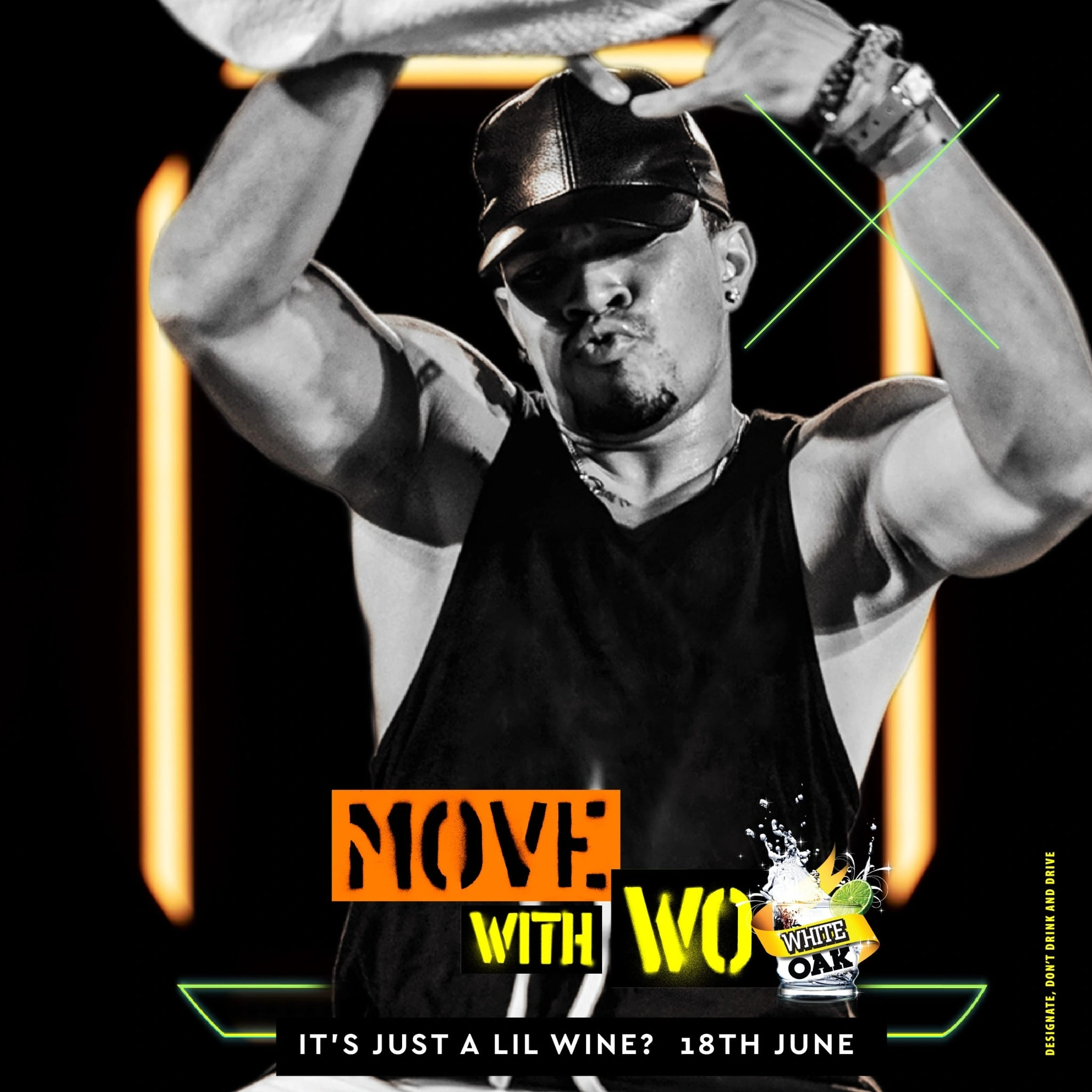
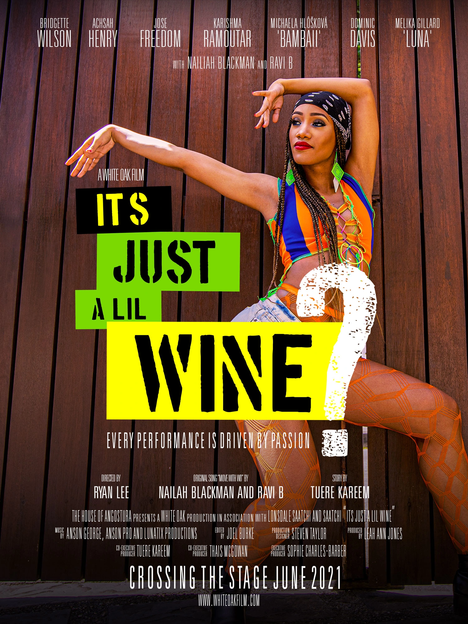
It’s Just
a Lil Wine?
Or is it a whole culture in motion?
Wining can be reduced to a familiar Carnival image. The documentary makes room for the people, practices and perspectives behind it. Performance and conversation turn a recognisable movement into a subject worth exploring.
White Oak’s role extends into cultural storytelling, helping bring those voices into view.

05 / The rebrand
How do you change the look
without losing the feeling?
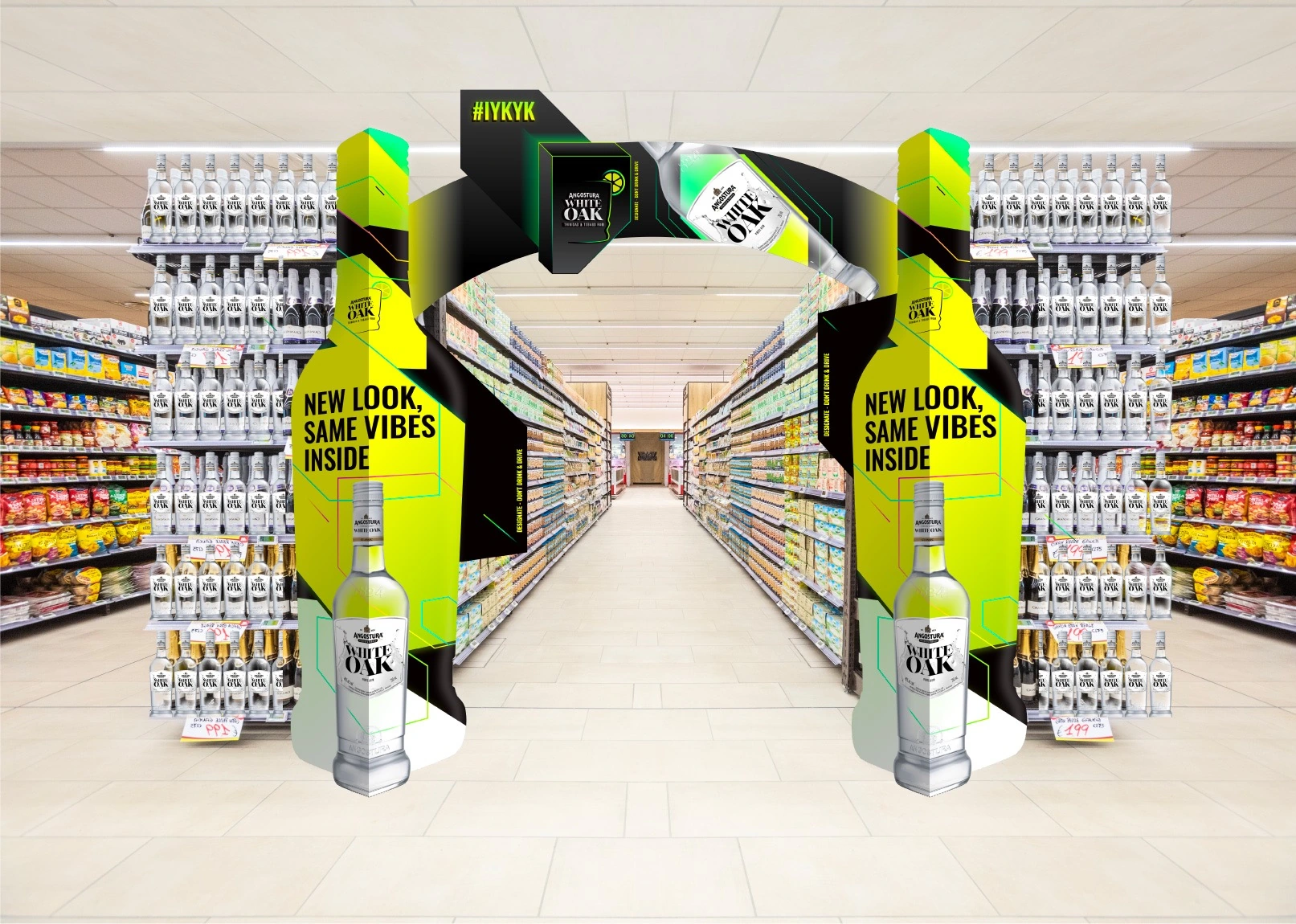
The brand’s expression had moved forward. The identity needed to carry that same confidence, from bottle to shelf to screen.
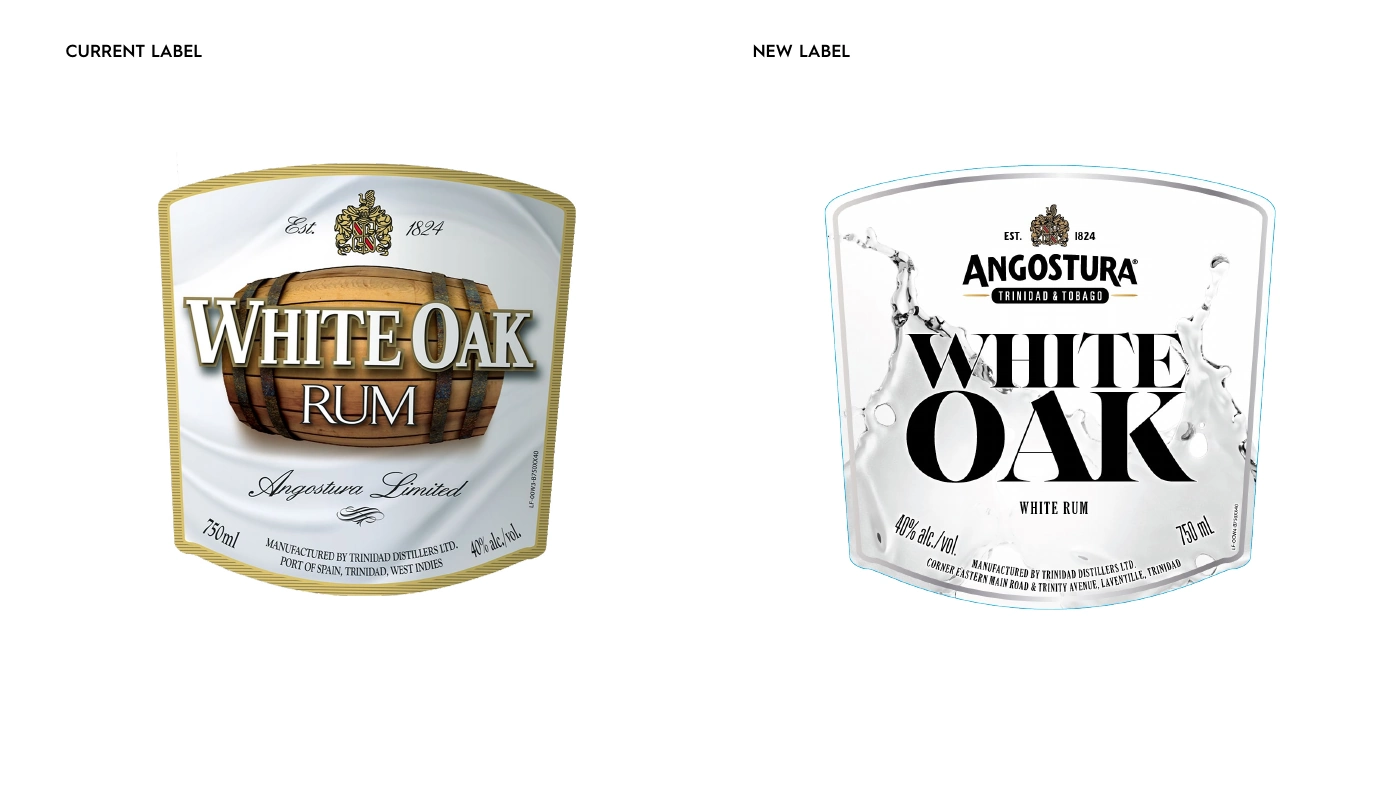
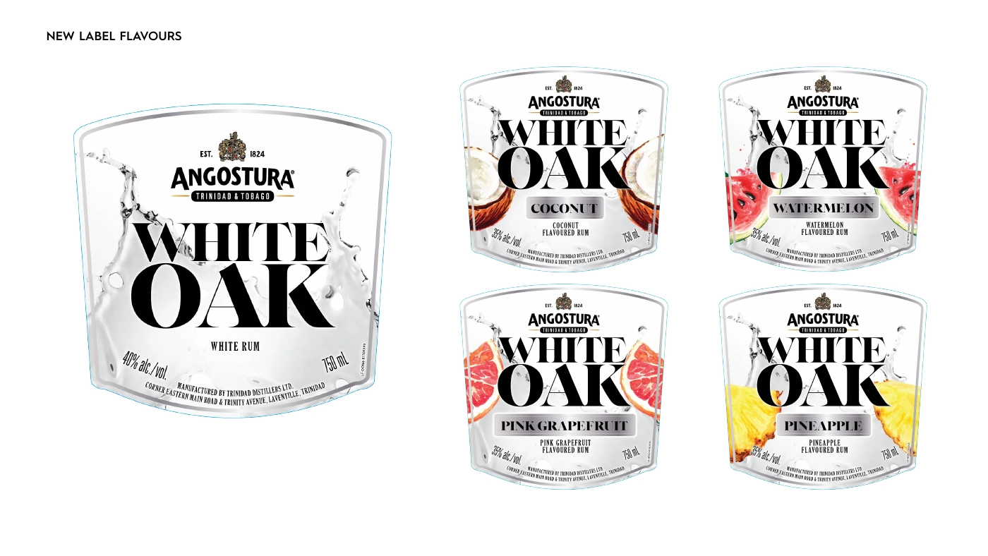
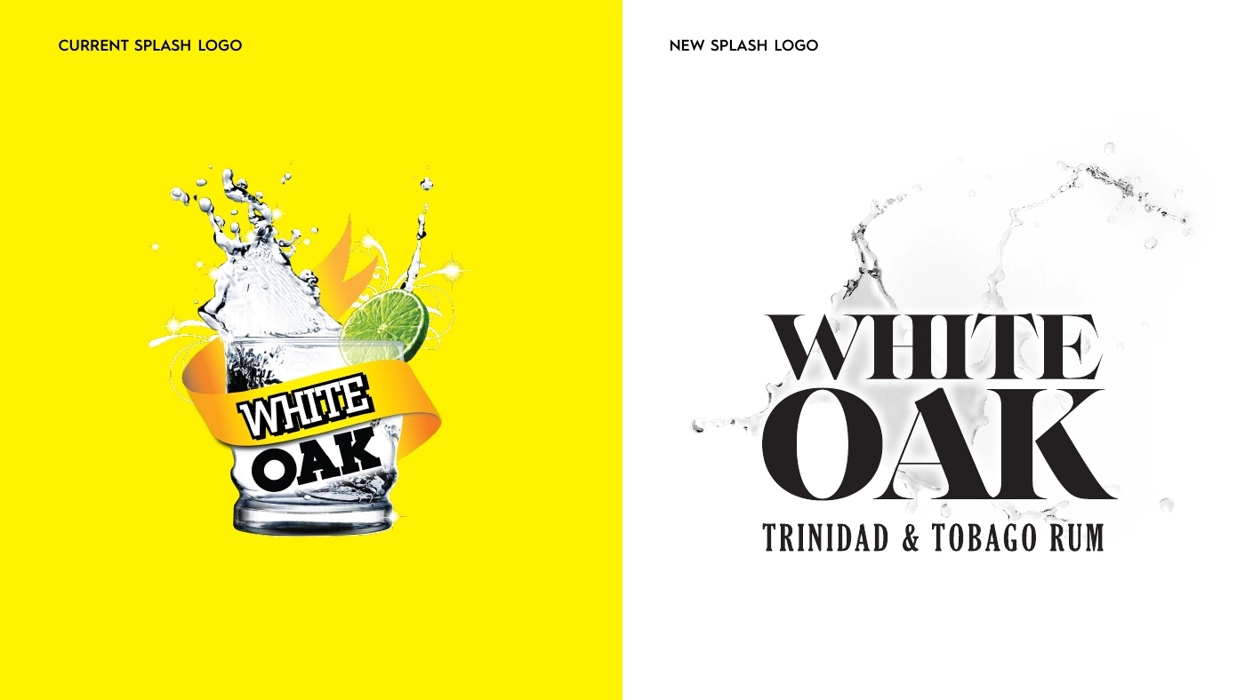
The evolution brought the name into focus, gave the flavour range a consistent design and made the Trinidad & Tobago origin more prominent.
Let White Oak lead.
A bold, stacked wordmark replaces the barrel-led composition. The name becomes the dominant feature, with a cleaner hierarchy across the label.
Keep home in the picture.
Angostura’s name and crest remain part of the identity. The Trinidad & Tobago wording gives the brand’s origin a clear place on both the label and standalone logo.
One family. Different flavours.
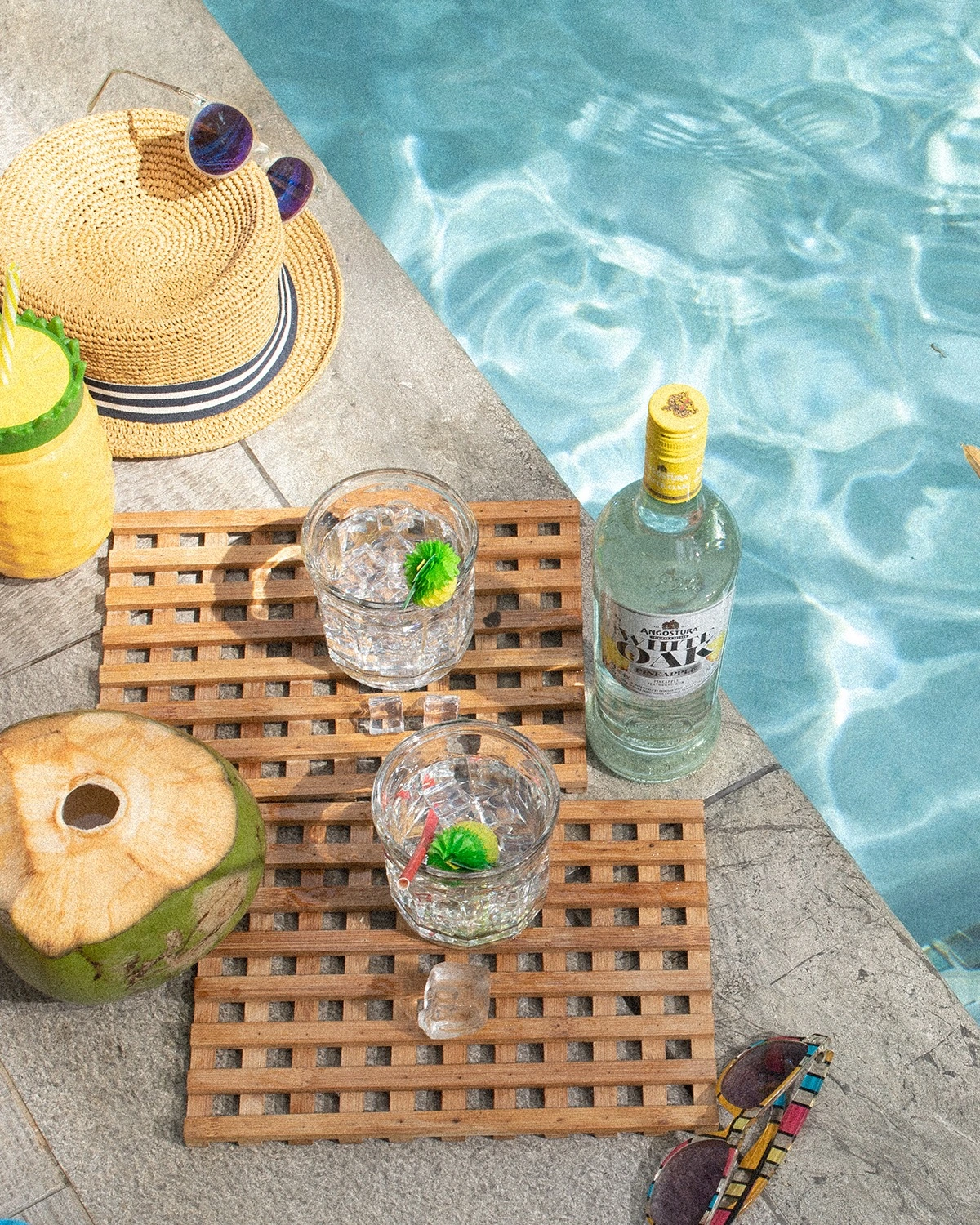
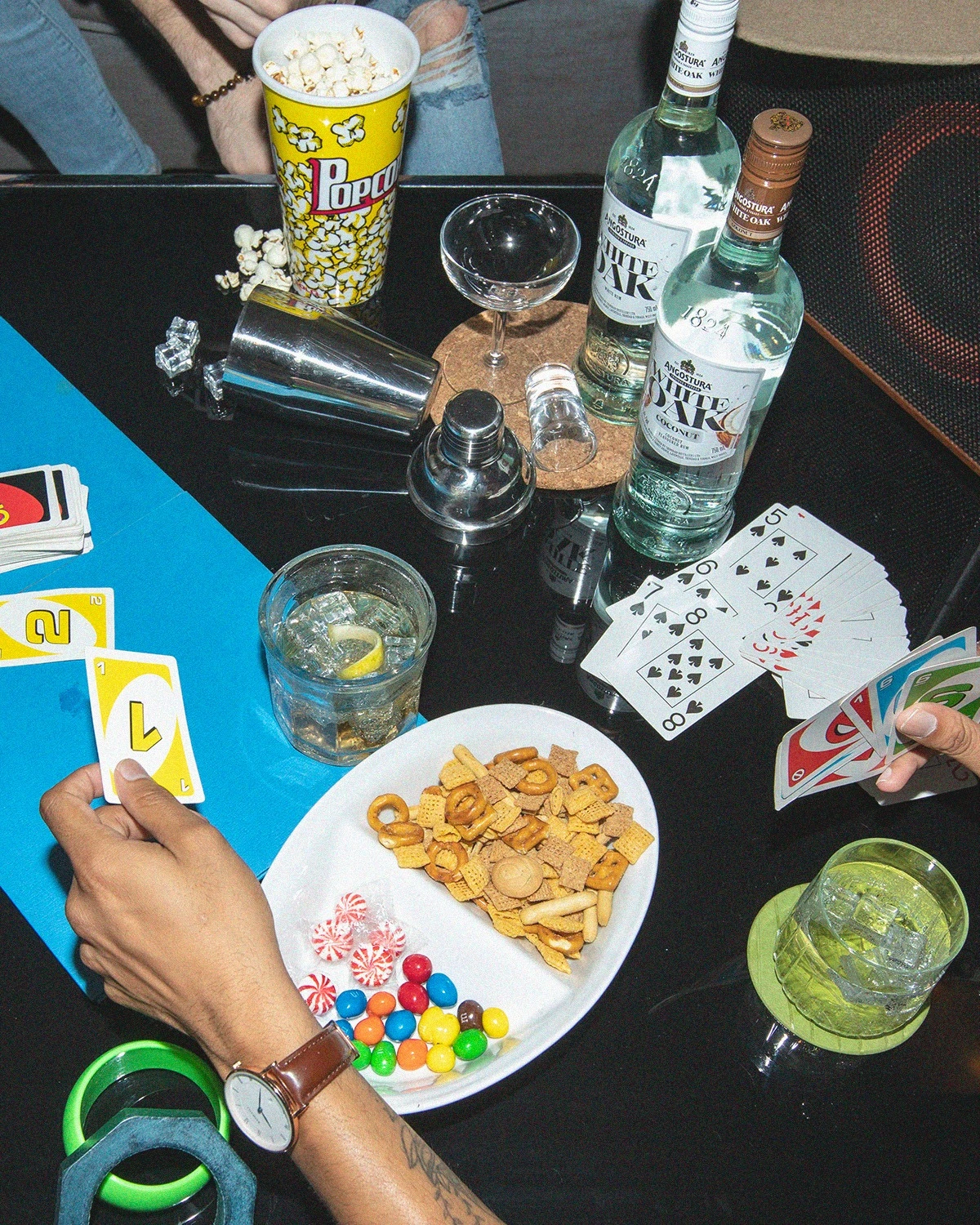
The same label structure carries across coconut, watermelon, pink grapefruit and pineapple. Fruit imagery distinguishes the flavours while the White Oak name holds the range together.
The identity in use
New look.
Same vibes inside.
06 / IYKYK
If You Know
You Know.
When the audience gets it, how much do you need to say?
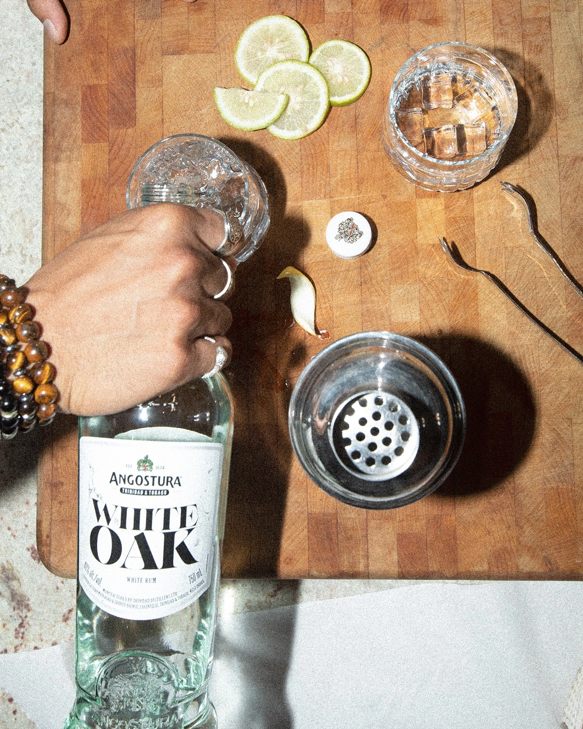
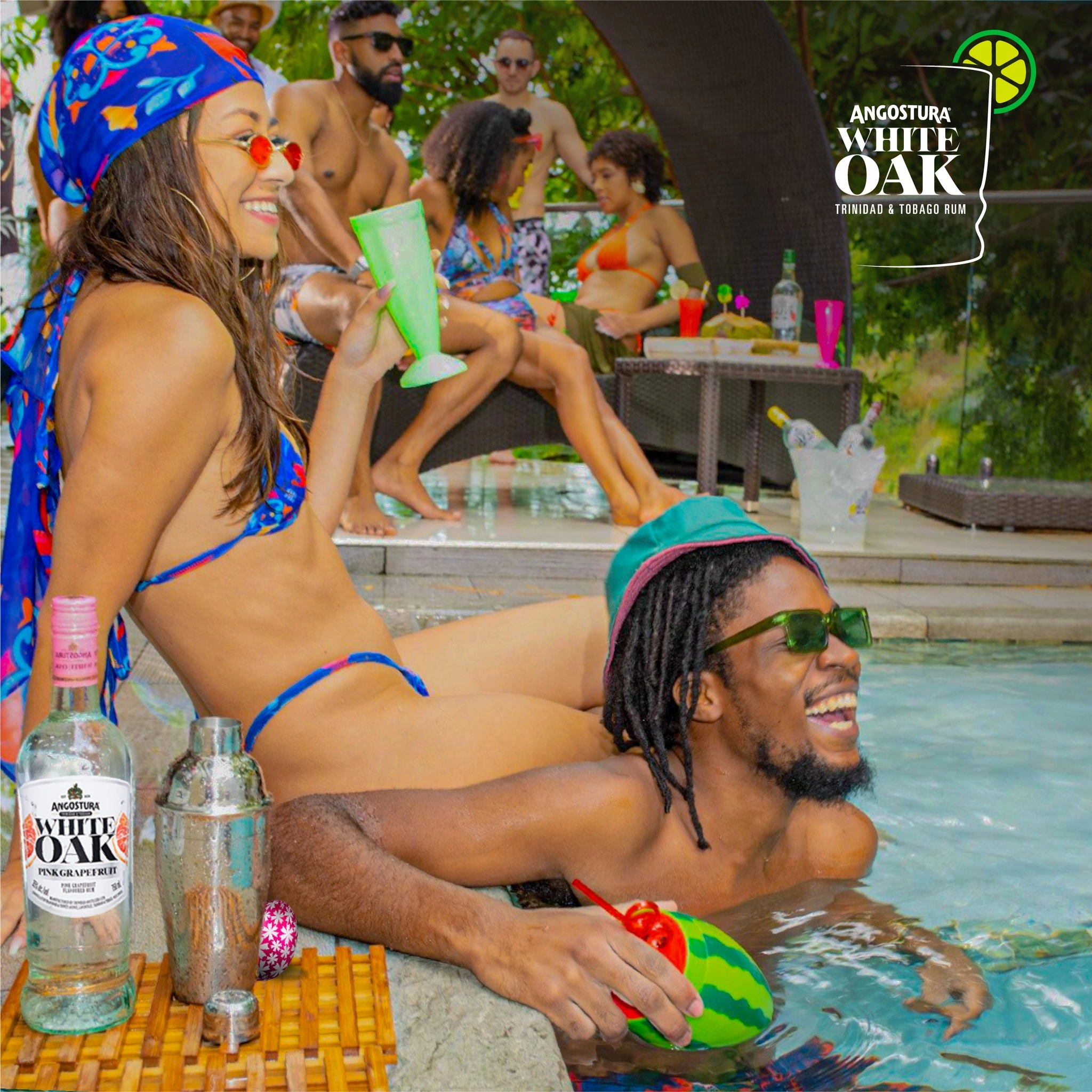
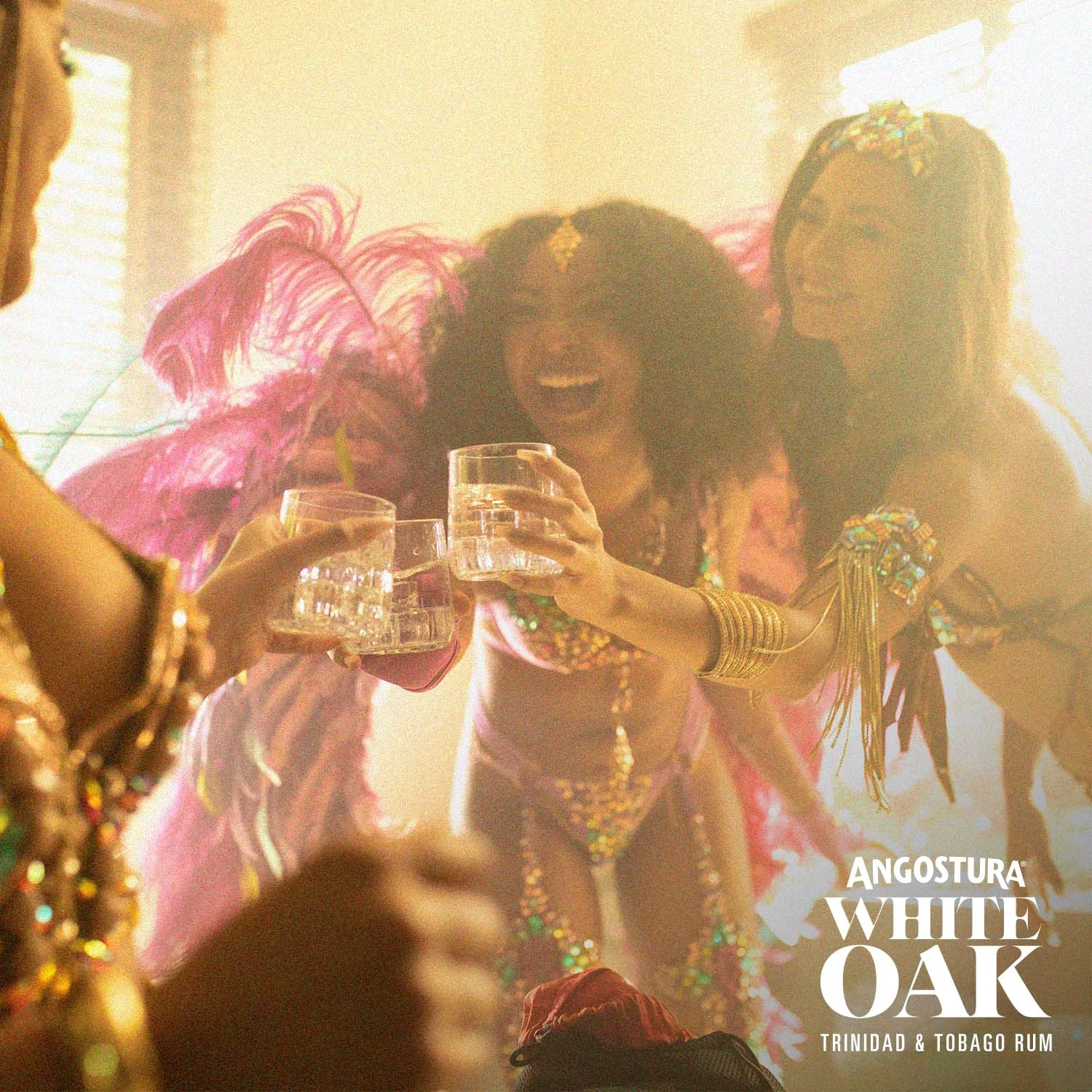
The next campaign gave the new identity a social language. IYKYK is the shorthand for a shared understanding: getting ready, getting together and those moments that need no explanation.
The work brings that feeling into film and photography, connecting the evolved White Oak identity with the people and occasions around it.
The campaign in the feed
A knowing look.
A shared language.

How the brand travels
A brand travels further
when people carry it.
Across these projects, White Oak moved through campaign, entertainment, music, documentary and a new visual identity. Each offered a different way to participate in the same cultural world, and a fresh reason to make the brand part of everyday life.
The thread is cultural recognition. In the stories, the people and the design, the brand gives an audience something familiar to connect with and something new to discover.
Selected work developed with the team at Lonsdale Saatchi & Saatchi and production collaborators. Roles across the wider White Oak relationship included creative direction, concept development, art direction, styling and set design.
A project. A new chapter. A conversation.
What could we
build next?
A brand ready for its next chapter. A business with bigger ambitions. A team looking for creative and marketing leadership.