
Caribbean Airlines · Story 04 / 08
How does a Caribbean airline
take on a US giant?
Make the Caribbean
the reason to fly.
Alongside bigger international carriers, Caribbean Airlines had a distinctive connection to build on: the people, culture and character of the region.
“We Got You” and the rebrand gave that connection a voice and a visual expression. A promise people could sing. An identity that carried the region into the journey.
01 / We Got You
When does a jingle
become an anthem?
“We Got You” turned the reassurance of an airline promise into something people could sing. Machel Montano’s vocals gave the message a familiar voice and the energy of soca.
The motion graphics connected that sound with the people and occasions that make travel matter: getting home, seeing family, taking a break and being part of the celebrations.
The campaign film featuring Machel Montano, with animated lyrics, Caribbean destinations, airline staff and scenes of celebration.
The audience response
From the airwaves
to the stage.
The case-study film captures listeners singing along, sharing reactions and asking Machel to perform the jingle live. It follows that response through to footage of the song reaching the stage.
A useful lesson in cultural relevance: a brand message travels further when people find a place for it in their own lives.
The story of the jingle’s audience response, including social posts, singalongs, requests for a live performance and concert footage.
02 / The rebrand
What if the brand moved
like the region?
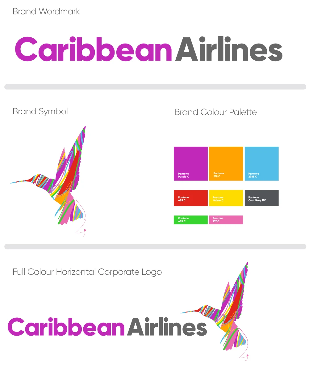
The visual identity made the same connection through colour and movement. The familiar hummingbird remained, re-expressed through bright, flowing lines that reflected the diversity of the Caribbean.
The design philosophy linked those lines to the frequency of travel, the energy of Caribbean culture and the different hues of hummingbirds across the region. Caribbean Airlines became the connector.
Recognition with room to grow
One bird.
Many ways to fly.
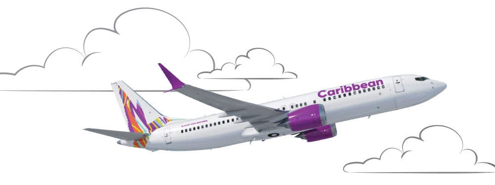
The hummingbird gave the rebrand continuity. The palette, typography and graphic language gave it greater range—from a small badge to a vehicle, a departure desk or an entire branded space.
The guidelines also connected services such as Caribbean Miles, Cargo, Duty Free and Club to the parent brand. Different parts of the business could speak clearly while belonging to one family.
A personality with both sides in view
Frank and friendly.
Professional and lively.
Homegrown and world-class.
The voice combined the assurance expected of an airline with the warmth and familiarity of the Caribbean.
The visual language
A rhythm you
can recognise.
Expressive lines could convey excitement, settle into a gentler wave or give a photograph a sense of movement. Bold colour blocks made the identity visible at a glance, with clear space for practical information.



The identity in use
Caribbean character.
Ready to travel.
The hummingbird gives the aircraft a distinctive signature. In destination artwork, the same flowing lines connect the place, the promise and the airline.


Creative direction at Lonsdale Saatchi & Saatchi, working with the agency and Caribbean Airlines teams. “We Got You” featuring Machel Montano. Selected identity artwork from the 2020 brand guidelines, alongside supplied aircraft and destination visuals.
How the brand travels
Take the region
with you.
The jingle gave people a reason to join in. The rebrand gave the airline a consistent way to express its character across services, places and audiences.
That is the opportunity in cultural connection: making the place a brand comes from part of the reason people choose it.
A project. A new chapter. A conversation.
What could we
build next?
A brand ready for its next chapter. A business with bigger ambitions. A team looking for creative and marketing leadership.