Trinitario · Story 01 / 08
How do you take
Tobago to Harrods?
Start with what makes it special.
Make sure the world can see it.
I led Trinitario’s rebrand and UK positioning, bringing Caribbean cocoa, colour and flavour to an international stage.
The redesigned range is now rolling out into Harrods, alongside a limited-edition branded collaboration.
01 / The rebrand
A bigger stage.
The same roots.
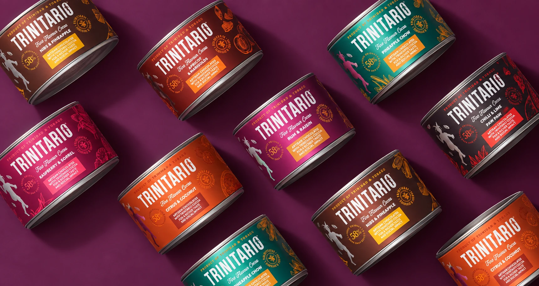
The opportunity was to make the quality of the chocolate visible before the first taste. A distinctive identity, a connected product range and packaging that could hold its own in an international retail setting.
The answer began at home. The colours of cocoa pods from the estate became the starting point for the packaging palette, carrying the origin into every part of the range.
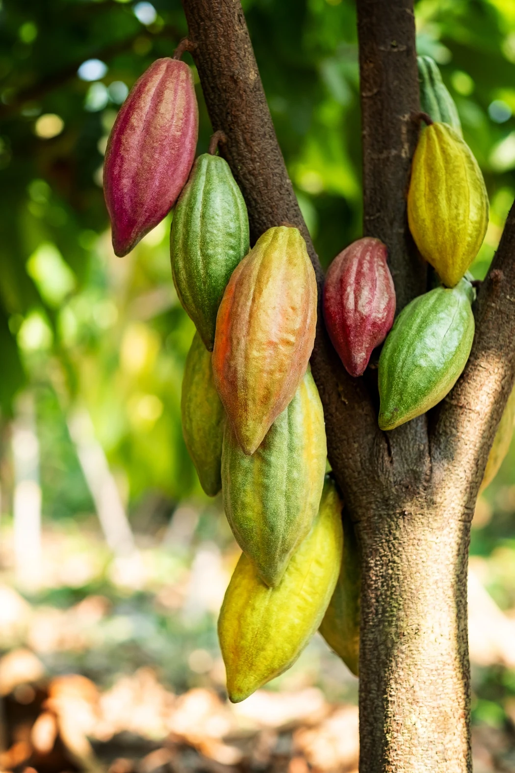
The colour was already growing.
From the pod.
To the pack.
The palette gives each flavour a presence of its own while keeping a clear connection across the collection. A way to stand out on a shelf and carry a little of the estate into the world.
Inspired by Caribbean rhythm and the shape of a cocoa leaf, the Cocoa Dancer brings movement and personality. Fine botanical illustrations tell the flavour story. Together, they create an identity that can travel across formats without losing its character.
02 / The collection · The signature tins
A taste of the place.
A reason to keep it.
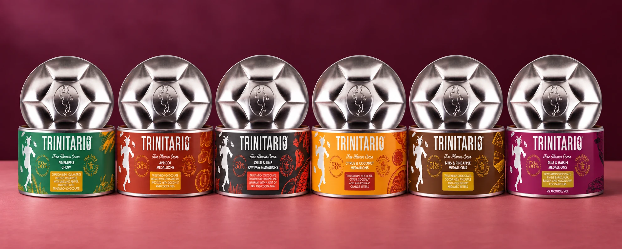
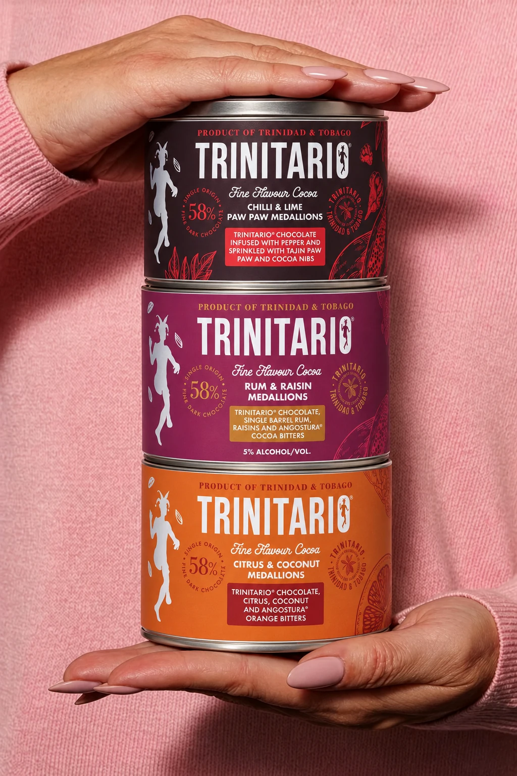
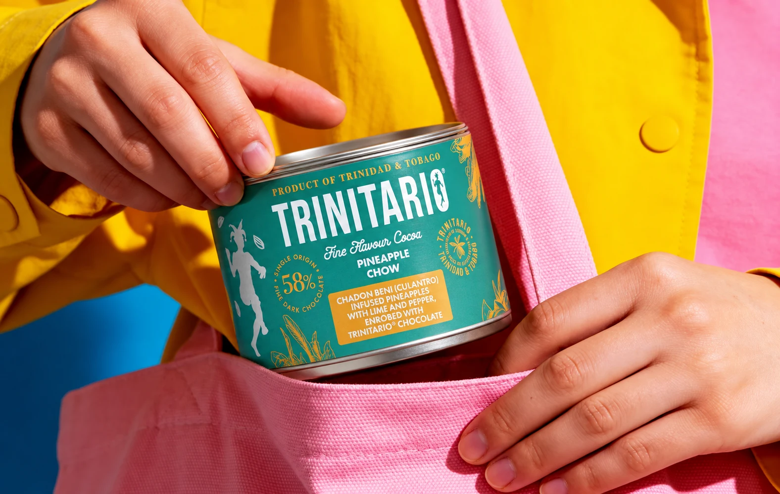
The tins are the centrepiece of the range. Distinctive colour, ingredient illustrations and the Cocoa Dancer turn each flavour into a small expression of Trinidad and Tobago.
The steelpan-inspired lid adds another connection to the culture. Chocolate to share, a gift to take somewhere and packaging with a character of its own.
More than a beautiful container
Make the origin
part of the appeal.
From pineapple chow to rum and raisin, the flavour names, illustrations and colours give people a way into the story. The packaging carries the place as confidently as the product.
The tins, in motion
The flavour.
The feeling.
The culture.
The same identity moves into social content, bringing the packaging, ingredients and steelpan connection together.
The collection · Medallion pouches
Same character.
A different occasion.
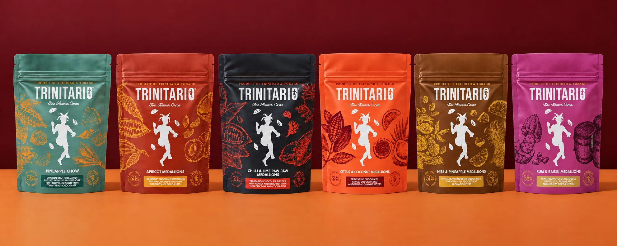
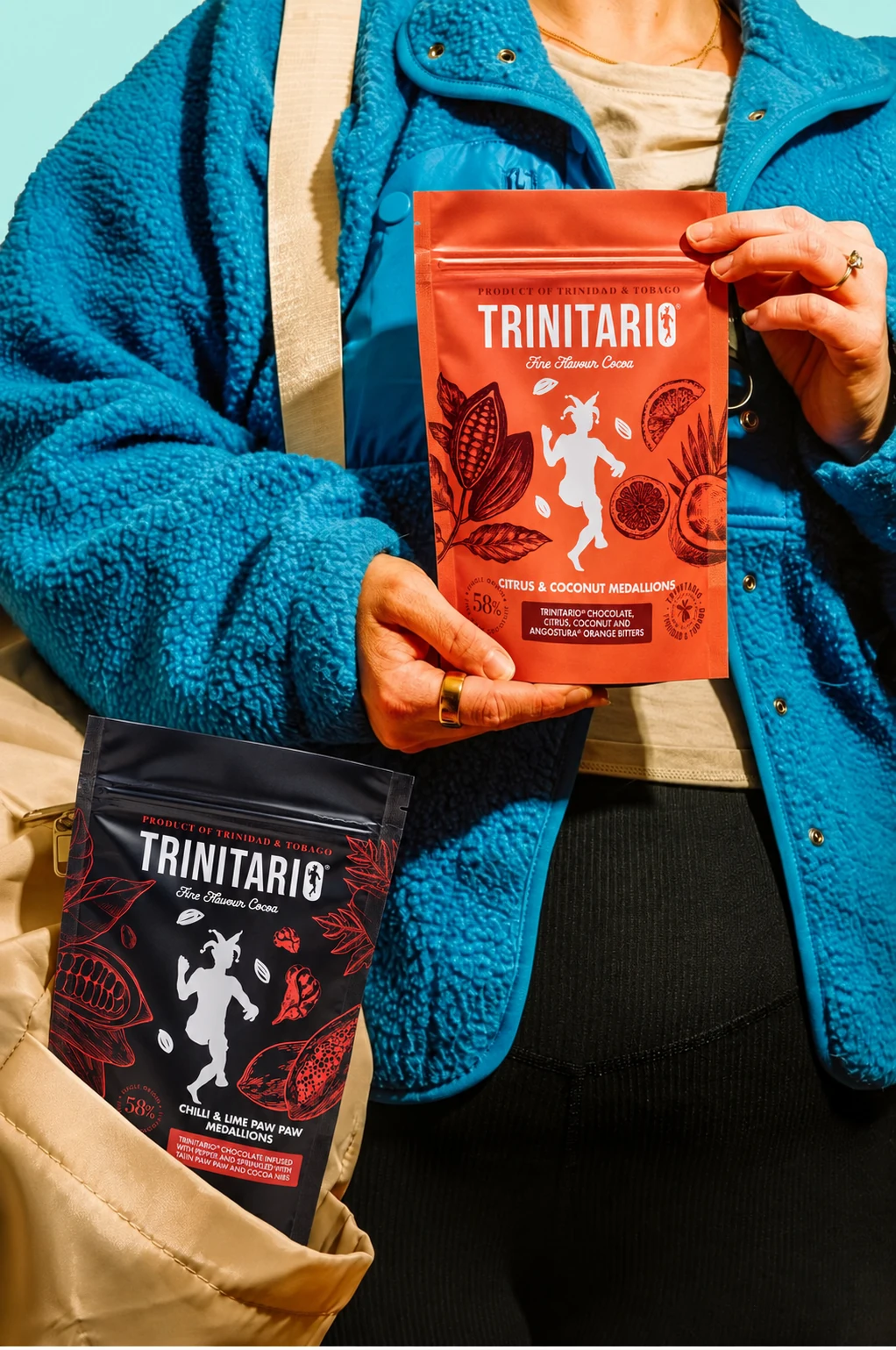
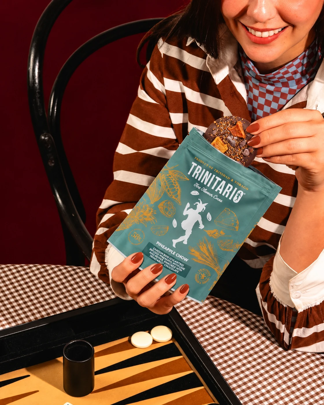
The pouches carry the same flavour colours, illustrated ingredients and Cocoa Dancer into another format. The range stays recognisable, whether it is picked up for a gift or opened for a moment of indulgence.
The collection · Chocolate bars
Different expressions.
Distinctly Trinitario.
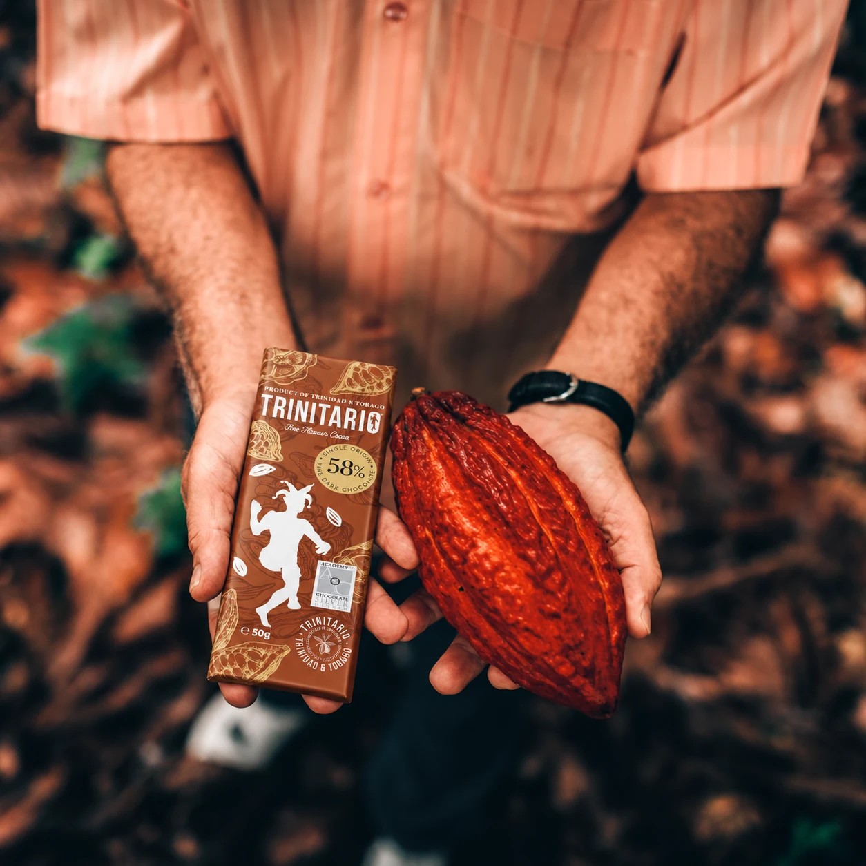
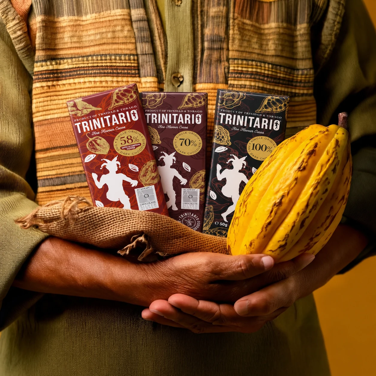
The chocolate bars bring the same identity into a smaller canvas. Cocoa percentages and flavour details lead the choice; colour, illustration and the Cocoa Dancer keep the connection to the wider family.
03 / Trinitario × Harrods
Product rollout underway
A small island.
An iconic address.
The international ambition is becoming tangible. Trinitario products are currently rolling out into Harrods, taking the redesigned range onto a new stage.
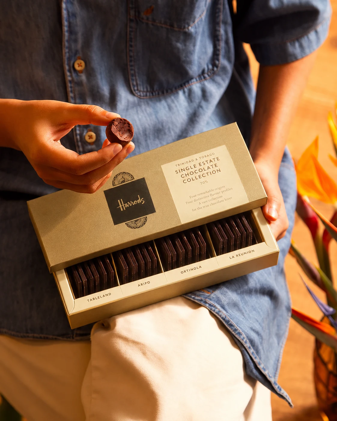
Alongside that rollout, we created a limited-edition branded collaboration product with Harrods. A new expression of the partnership, built on the same fine cocoa and distinctive origin.
Origin becomes the experience
Four estates.
Four reasons to explore.
The 70% single-estate collection brings together cocoa from Tableland, Aripo, Ortinola and La Reunion. Each estate offers its own flavour profile, inviting people to taste the differences within Trinidad’s fine cocoa.
The partnership gives provenance a clear role: it becomes the reason to discover, compare and choose.
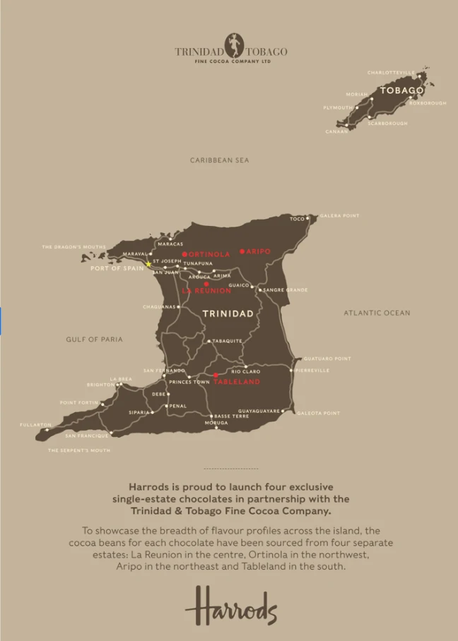
A brand travels further when its origin gives people a reason to choose it.
04 / The Chocolate Lab · Replanting the future
How do you grow
more than cocoa?
A brand’s journey can create opportunity where it began. Alongside Trinitario’s wider cocoa replanting ambition in Tobago, the Chocolate Lab gives people a place to develop skills, test ideas and create products.
The communications needed to make that possibility tangible. To show what cocoa can become in the hands of the people who work with it.

A new role for the brand
Same roots.
New possibilities.
The Lab sits within the Trinitario family, connecting courses, product development and the Chocolate Lab Shop in Tobago. The shared wordmark and Cocoa Dancer keep that relationship visible.
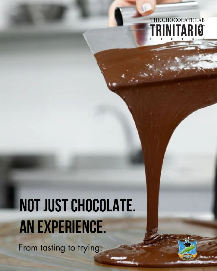
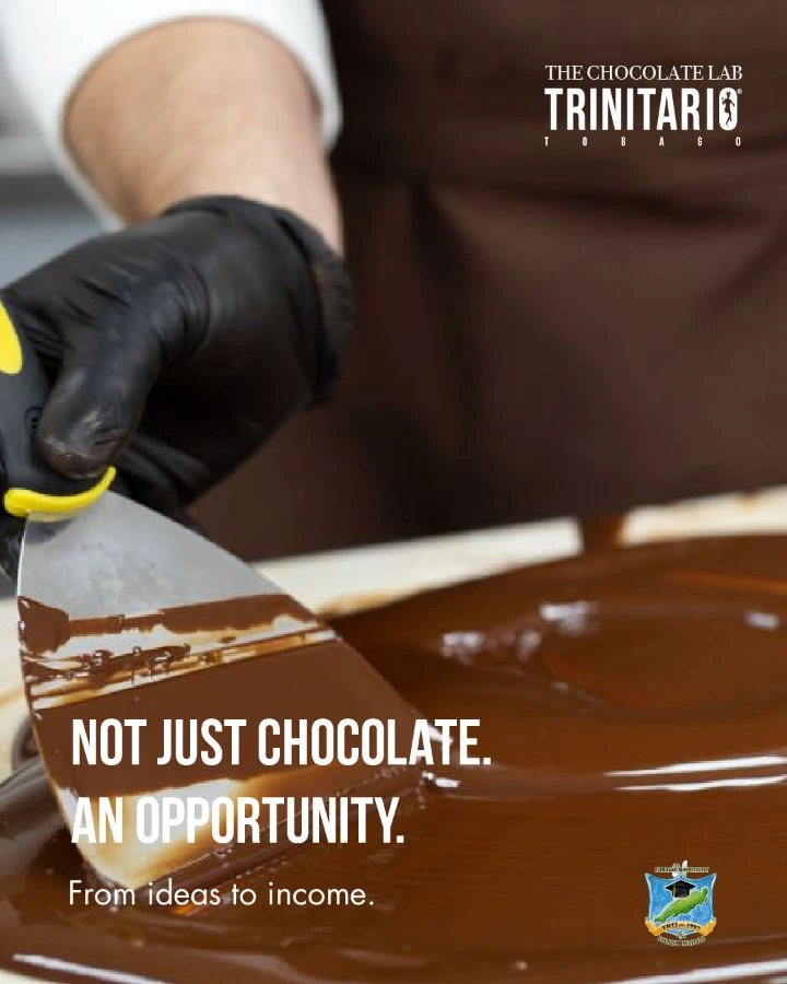
Its own personality comes from the work: chocolate poured, tempered, moulded and tasted. Black and white give the identity clarity; hands, tools and warm cocoa tones bring it to life.
Test an idea.
Give new products somewhere to begin.
Learn by making.
Connect practical training with the work of handling chocolate.
Build what comes next.
Make the connection between a skill, a product and the possibility of income.
One line. Room to grow.
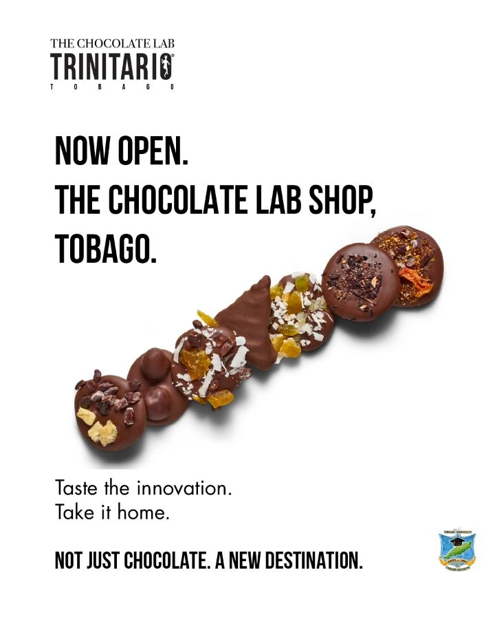
Not just
chocolate.
The campaign line stays constant. What follows opens a different door: an experience, an opportunity, a destination.
That gives the Lab a language that can move from inviting someone to try chocolate-making to introducing the shop. A clear invitation, with the process and product doing the talking.
Project partners / Tobago House of Assembly · Tobago Hospitality & Tourism Institute
How the brand travels
Go further.
Grow something here.
The same origin can mean something different to a gift buyer, a pastry chef or someone learning a new skill. The work gives each of them a reason to connect with Trinitario.
A recognisable identity, a clear commercial story and a purpose that reaches back to the place it began.
A project. A new chapter. A conversation.
What could we
build next?
A brand ready for its next chapter. A business with bigger ambitions. A team looking for creative and marketing leadership.